We have owned our house for almost a year. We have lived there for almost 10 months. And I have yet to post any photos of the house as it has evolved. What can I say...we have been busy.
So let's start with the kitchen! The kitchen is one of our most used rooms since I cook far more often than we order takeout. Having a kitchen that is comfortable, efficient and inviting was important to both M and me, because not only do we use it constantly, it is the first room you see when you enter our house. Our goals for the space were to make it feel open and comfortable, to maximize storage space while not overcrowding the walls and (this may have just been me) to ensure that the IKEA DOMSJÖ double sink would fit into the overall design plan. For anyone who has been stuck with a too-small sink for any amount of time, I cannot oversell the value of a gigantic double sink. I actually hugged it after it was installed. But I am getting ahead of myself...
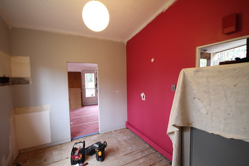
The first step in creating our new kitchen was to demolish the old one. Well, actually, that isn't true. The first, first step was to determine the design of the new space. We wanted to make as few structural changes as possible to keep costs down so we resolved to keep most of the appliances and all the plumbing in the existing configuration. The kitchen has two doorways, one facing the entryway and one facing the dining room, both of which originally had doors. Since we knew we would be in and out of the kitchen all day the doors had to go and I actually removed one of them on closing day. The original doorways were a standard 30" wide which made the kitchen feel very closed off from the rest of the house so in addition to removing the doors, we decided to widen the doorway into the dining room as much as we could. Though the door leading into the entryway would have to remain the same size, the layout we eventually chose necessitated moving the opening about 6 inches to the right to accommodate the cabinets we planned to add to the magenta wall.
 |
| Doorway into dining room before renovation. |
 |
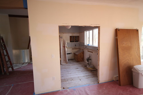
| Cabinets and accordion door removed. |
 |
| Doorway after widening. |
 |
| View of widened doorway from dining room. |
Next in the design process was determining the feel of the kitchen. The house is a mid-century modern and we wanted to make sure that the new kitchen would fit in with the rest of the house. Between the look we wanted and the budget we had, it didn't take long to narrow our options to one: IKEA. In case I haven't put it out there before, we are HUGE IKEA fans and the majority of our furniture hails from that giant Scandinavian warehouse. Our house is basically an IKEA catalog and we are okay with that. We have two small children which means that we don't want to own things that are precious or fragile or expensive. Bam. IKEA. Anyway, in a happy instance of serendipity, we were planning the kitchen remodel just as IKEA was having its annual kitchen sale. As long as we spent $4500 or more, we would get 20% off of our total kitchen purchase, from appliances to cabinets to drawer dividers. Sold.
M spent the better part of a month wrestling with IKEA's online kitchen design tool. We made at least 5 trips to our local store (45 minutes away), with and without the Numa, to choose cabinets, ogle my sink and pick finishes. After many hours of deliberation, we decided to go with NEXUS birch veneer cabinet fronts with stainless LANSA handles, chosen both for the look and because the flat-front NEXUS style makes the cabinet faces much easier to clean. We debated purchasing IKEA appliances but in the end we only went with the NUTID wall mounted hood; all of our other new appliances are from Bosch. And after many, many hours of cursing at the slow, bug ridden kitchen design tool, M finally arrived at a layout that we were excited about. The new configuration kept the fridge, sink, cooktop and exhaust fan in the same locations as the original kitchen. We added a wall oven and microwave to the wall opposite the window along with lots of new cabinets to increase the storage capacity. We also decided against putting upper cabinets on the wall above the sink to keep the room from feeling crowded, which was the absolute right decision.
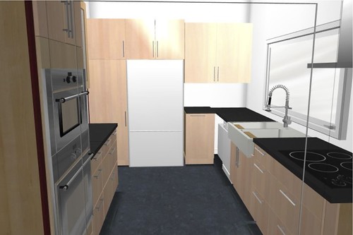 |
| Final layout, as seen from the dining room. |
Next up: demolition (ignore that you have seen part of that above) and painting.
Be well,
Me
No comments:
Post a Comment